Layout before computers
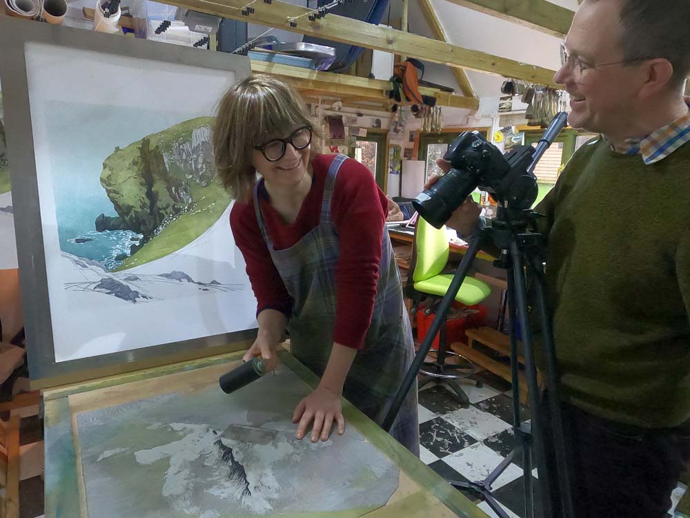
Sal Shuel recalls the working life of the layout artist in the 1950s
When I was an art student, in order to earn a bit of spare cash, I used to help my father mark up the magazine of which he was editor, art editor, illustrator, writer. I don't remember that he ever paid me but I did learn how to produce an accurate mark up. Let me get this straight, I became a layout artist. I was not a 'typographer'. These were far more exalted people allowed to think and design and used strange typefaces and be experimental. I was a layout artist and I did as I was told. On reflection, I realise that what I really wanted was to design beautiful books full of words but it never happened. I eventually spent eighteen months in an advertising agency which I loathed, working as a 'jobbing typographer' which I did efficiently then abandoned - but it was like riding a bicycle. You never forget and the more I think about it now, the more I remember.
There are many people who can't believe there was once a time when there were no computers, no laptops, no tablets, no mobile phones. These days it's a matter of moments to lay out a page, add pictures that were maybe taken only moments before or were filched from the enormous amount of online stuff most people assume is free-for-all (although it isn't), add the copy, size it up so it fits and bingo. I was a student in the nineteen fifties and computers were huge affairs which didn't do much. In 1951 I went to the Science Museum where a monster computer had been installed with which visitors could play noughts and crosses – and not much else. Even in the sixties, when Sainsburys installed Emidec, their first computer, Stamford Street near Blackfriars Bridge was closed to all traffic for the weekend whilst this monster was craned through a huge hole which had been made in an upper floor in order to accommodate it. I would guess the laptop I am using now could do as much as Emidec.
Before computers, everything was done with layout paper, bizarre rulers, slide rules or cheaper gizmos which were easier for those of us, like me, who couldn't fathom a slide rule. Our bibles were type specimen books filled with classic type faces as well as some abominations, usually offered as whole alphabets as well as a printed block in Latin – always the same. Pompeius qui non modo eorum qui nunc sunt gloriam, sed etiam antiquitis memoriam virtute superet, quae res quae cuiusquam animum in hic causa dubium facere possit quis hoc homine scientior umquam aut fuit aut esse debuit? I didn't know what it meant then and I still don't. There were sheets of casting-off tables to enable a jobbing typographer to work out how to fit X amount of copy into Y space in Z type face. Bear in mind this was long before the days of pocket calculators, and there were still a few people in the fifties who used an abacus! Copy had to be word counted which wasn't a problem except when it was hand written and casting off tables were used to calculate how many words per line could be achieved with say Times New Roman in 12 point and if it was necessary to settle for 10 point instead (not all typesetters had 11 point) and if so would it be better to use a typeface with a larger X-height like Ionic and remembering that Perpetua is pretty but hopeless on newsprint. Counting words was relatively easy; typewriters typed even spacing in those days and individual letters could be calculated using a type scale. The rule of thumb was that the average amount of letters per word in a bit of copy was 6 so a line of 72 letters and spaces was about 12 words so 40 lines was 480 words of copy. It was often hopelessly inaccurate because intellectuals used longer words than the hoi polloi. Some type faces needed leading and that calculation needed to be determined and specified. Layout artists told typesetters absolutely everything in order to be able to blame them of it came back wrong. The specifications were sent to a typesetter who might have his own ideas about spacing which could throw out all the initial calculations which is why it was best not to allow them the opportunity to think. A printed galley would return for proof reading which meant endless correction and adjustments using signs and symbols known only to those in the business, most of whom will still be able, sixty years on, to proof read a page and use all the correct symbols.
Reliable layout artists came to understand type faces pretty well and would fight back at typesetters who insisted a bit of copy wouldn't fit. Whist I worked in advertising I specialised in squashing copy and a logo into the ads for a car hire company who advertised in the small ads in the Evening Standard every day. These things were about an inch and a half by an inch or less and I kept the job because I got very good indeed at manipulating Ionic, a neat little type face with a big X- height. If I said it would fit, it fitted! The tiny little ads were too easy and tedious, eventually drove me mad and I fled.
Layout artists worked in inches, ems and points, 72 points to an inch. An em was called that because it was originally calculated as the width of a 12 pt letter M. An en was half an em – an N in fact. This isn't an essay in mid-twentieth typography and I have won't even try to explain the complications to anyone locked into computer design. Layout artists used measurements which meant nothing to anyone else. They were lost without their type scale, usually a 12 inch steel ruler which measured in points and inches and ignored centimetres which were alien. There were two sorts of type scale, simple metal ones and 'Depth Scales' which were thick plastic and had multiple measurements on them. They tended to be known as 'the white thing with three long holes in it' – a good description because that's what it was. The long holes had measurements along them for all sorts of different point sizes of type. The ability to use this device accurately was what made a reliable layout artist.
Pictures could be a nightmare. Photographs were usually black and white, colour printing and photography was expensive. Prints to illustrate an article arrived with the copy and it was up to the layout artist to fit what was usually 10 x 8 inch prints into whatever space was decreed. As a rule, the prints came from jobbing photographers who were not particularly bothered about what happened to them as long as they were paid. For advertising purposes, the same print might be used many times for several versions of the same ad in different sizes. These prints would be mounted on card with a paper flap to keep them clean but nevertheless, over time they became increasingly dog-eared, liberally scattered with cigarette ash, coffee stains, sugar and general office rubbish. The backs of unmounted prints could be covered with several different mark-ups from previous uses, phone numbers, captions. Sometimes these were prints made by renowned photographers but they got no better treatment. Prints were expendable. Occasionally these prints emerge from the archives and, complete with all the coffee stains and scribbles, sell for eye-watering amounts on eBay.
A magazine would have a basic layout which was relatively constant and type and pictures would have to fit into the grid. A rough design of the page would be made in order to work out how big the pictures could be in relation to the copy then calculations would be made about type sizes after the number of words in the copy had been counted. A specification would be prepared, type set, a galley proof supplied and a paste-up cobbled together. The prints would be marked up for the block maker and proofs supplied. They might have required cropping to remove stuff which was unnecessary which was done by turning the print over on a light box, ruling lines with a soft pencil and scribbling over the bit you didn't want making sure that what was left was straight. If what was required was a cut-out, the print itself was attacked with process white paint which was often done appallingly badly and always wrecked the print. Every studio had little pots of process white which steadily became process grey and the stuff was used to disguise multiple sins. I once got chocolate on the original artwork for a Dettol advertisement and spent a lot of time with a clean pot of process white. It worked. The artwork was still being used months afterwards and I don't think anyone knew.
A photographic print or a piece of artwork needed to be marked up because it was rarely the same size as was required on the page. That's where the slide rule came in. The simpler slide rule was a Radius Aid, two circles of heavy duty plastic, riveted in the middle so the top one revolved against the bottom one. Both had figures all around them. Mine had instructions in the middle which said 'under the length as known set the length as required and under the known width read the new width'. It was simple and accurate but it had to be done right. The wrong information to the blockmaker would be followed slavishly which could be expensive. With an unmounted print, the specification was written on the back, the required width and the depth in inches – but sometimes in ems and done ideally with a 6b pencil. Care had to be taken not to press too hard and make an impression on the front of the print which would show up on the final block although the marks could be hidden with judicious attention with the back of a spoon.
It was the same with illustrations except these might be on card requiring a thin cover onto which all the same information would be written although often, the block maker got nothing but the original drawing on layout paper with a scribble at the bottom indicating the required width and the letters R.I.P. which meant 'rest in proportion'. Blocks were pricey and if it could be done, they were reused, particularly in advertising, which occasionally meant a complicated reshuffle of the type in order to make everything fit around a second-hand block but it didn't happen often. Usually each new version of an ad in a campaign would have a new block made from the old artwork. I once found myself having to adapt an ad with a vast scraper-board illustration of a tiger, designed originally as a half page in a broadsheet newspaper into a single column ad for a tabloid. I said it couldn't be done but I had to argue pretty hard.
Everything in the fifties was done by phone or mail, and was pitifully slow by the standards of today. There were a few couriers, usually spotty youths of about sixteen who hung about the production department, the nerve centre of any advertising agency or magazine, smoking cheap cigarettes, discussing football and flirting with anything in a skirt. Larger agencies employed them full time and they had bikes or a moped and occasionally a noisy, smelly motorbike. Sometimes, if something was wanted 'NOW', anyone who was available delivered it - by bus, on foot or in a taxi. In a brief but financially lucrative time when I freelanced, I would travel from Hampstead to Mayfair by bus, collect what needed to be done, return home, do the work and take it all back again, sometimes the same day but generally the concept of 'NOW' was slower in the fifties.
Funny how it's all changed. What I remember of how things were done in the fifties seems archaic. Writing this, after many years when I didn't think about it at all, brings it back vividly. Working with my father, anxiously marking up photographs, relieved when I got it right, waiting for the arrival of the printed magazine, playing at being a Real Typographer at art school with people who are now legends in the business and were far better then me, moving on to loathed advertising, sweating over minuscule bits of absurd layout, never really achieving what I wanted. It does seem odd though how the routine sticks in the brain. I can still look at pages from the magazine my father edited – now available online - and recognise photographs that I marked up in 1954. Picking up a Radius Aid, I could still use it very accurately if I had to and the ruler on my desk now is the same type scale that I used with my father despite the only bits that are any use being the inches. I haven't measured in points for sixty years.
There was so much more which seems archaic. The original Letraset which was a transfer that had to be washed off a sheet letter by letter and was incredibly difficult to do but necessary if a designer decreed a weird typeface that wasn't available from anywhere. Stuff called Zipatone which was exactly that, a tone for adding to artwork which was trimmed to size or area and rubbed down. Cow Gum which was used for everything which needed to be stuck down. Cow was rubber dissolved in volatile and highly flammable petroleum spirits which gave off unhealthy and addictive fumes which could cause drowsiness and dizziness. It didn't usually stain, came off relatively easily and could be dissolved with lighter fluid. Cow Rubbers were essential for removing surplus Cow Gum from artwork and were absolutely disgusting. They began with a small amount of Cow Gum rubbed off artwork. The thing got bigger and bigger and bigger over the months and became a filthy, smelly lump of 'stuff' but they were much loved by their owners. My husband says that his first employer had one called 'Willy' which was nine or ten inches long. Mine was not so impressive but it started well. I began it using Cow Gum to stick Day-Glo letters onto a life-belt for an advertising fashion shoot. The stuff went everywhere and by the time I had it done, I had my first real Cow Rubber.
It occurs to me that one of the biggest differences between then and now is that the digital revolution has eliminated the scruffiness of the fifties. We were peppered with graphite and coated with Cow Gum, ink, process white. The stench of Cow got into your skin and graphite into your hands. These days it's so easy and so fast and so clean. But it had its moments.
I was once stuck with a problem. There was a printing strike some time in the mid fifties and I got a temporary job with the New Statesman who were pasting up galleys and sending the paste-ups to France where the magazine was printed by nuns. I was handed a poem by John Betjeman but it was too long and I edited it to fit with a scalpel and Cow Gum and nobody noticed.